Samsung In-store App
Samsung | Tablet Application | UI/UX Designer | Agency: Barbarian
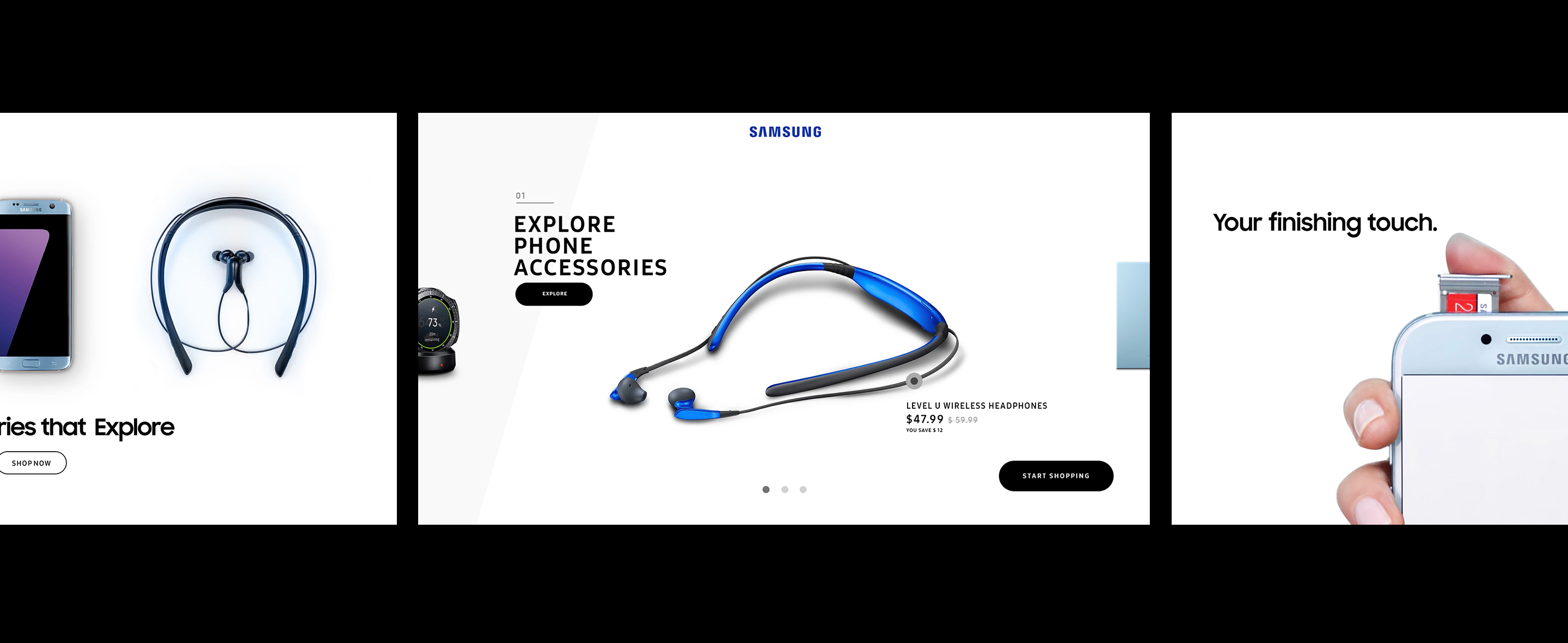
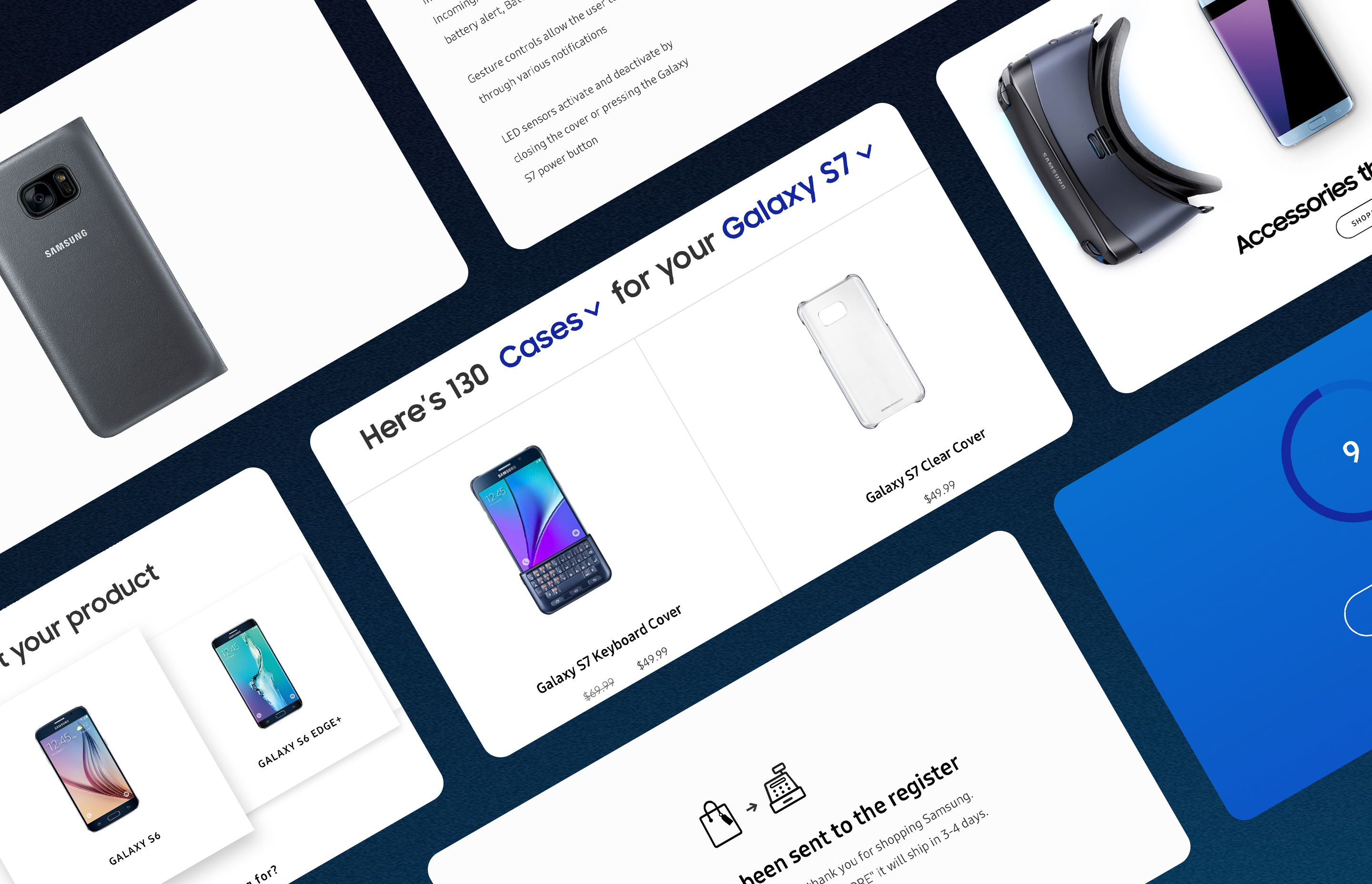
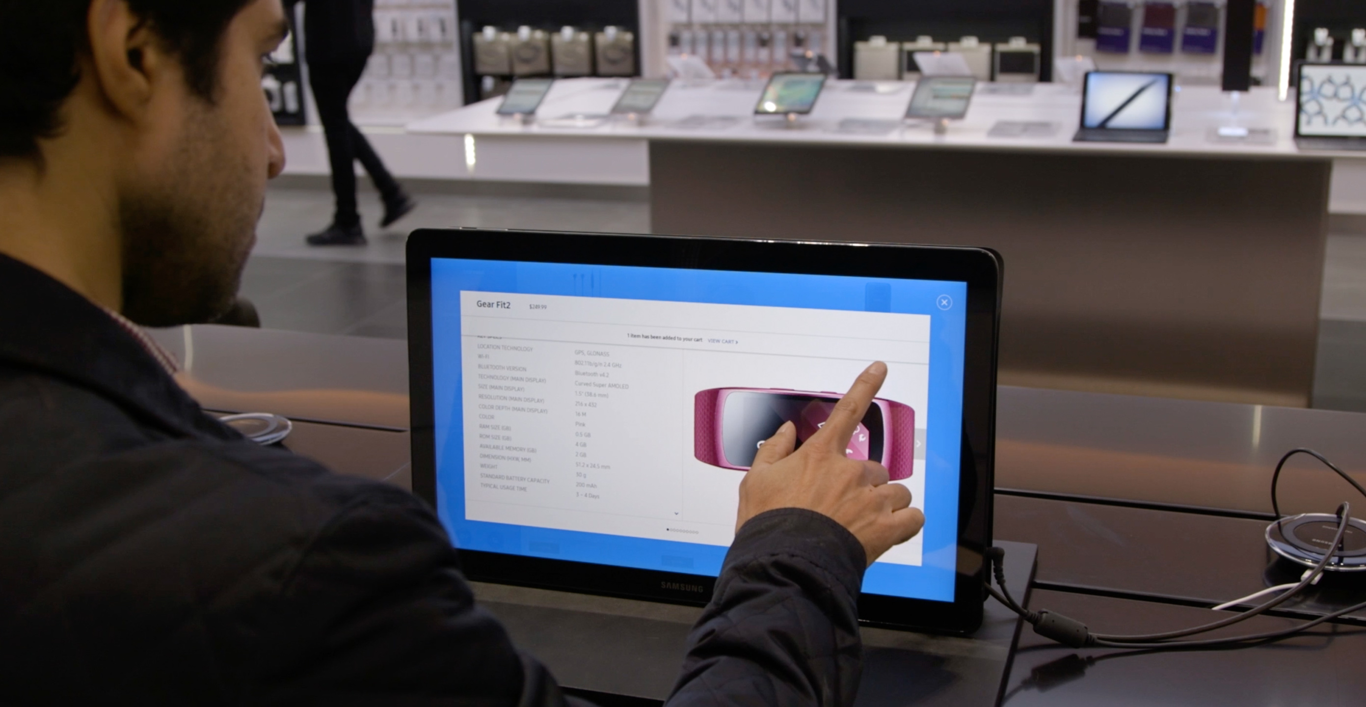
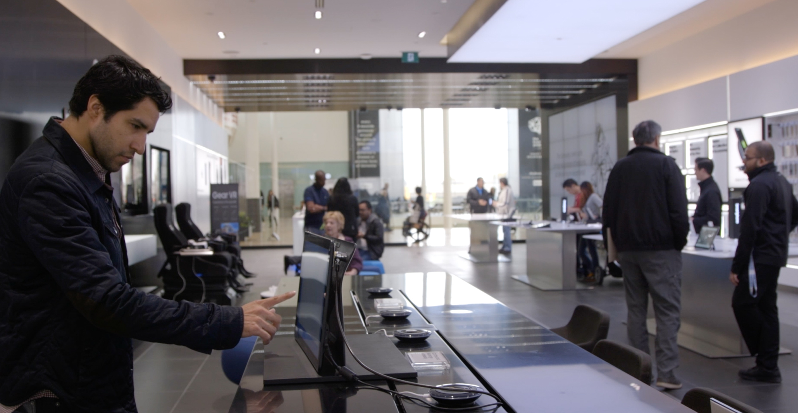
Samsung would like an opportunity to showcase the Galaxy View, one of Samsung Galaxy Products, a 19" size tablet in their new flagship store in Canada. Our team concept and designed an in-store shopping application that lives on Galaxy View and displays the product as kiosk-like to both promote the technology and enhance the physical in-store shopping experience.
Galaxy View tablet could stand on top of the tabletop. In the flagship store environment, where customers might prefer to have a spacious and comfortable shopping experience without a salesperson continually monitoring, we design a native app that helps customers shop in the store without necessarily interacting with the salespeople.
User goal: Using the Galaxy View app to speed up and smooth the purchase flow.
Business goal: Encourage the customers to interact with Samsung products and grow their loyalty towards the technology that Samsung provides.
Considerations: How might we convince the customers to interact and shop with the device? What is the experience when users interact with an unusual tablet size?
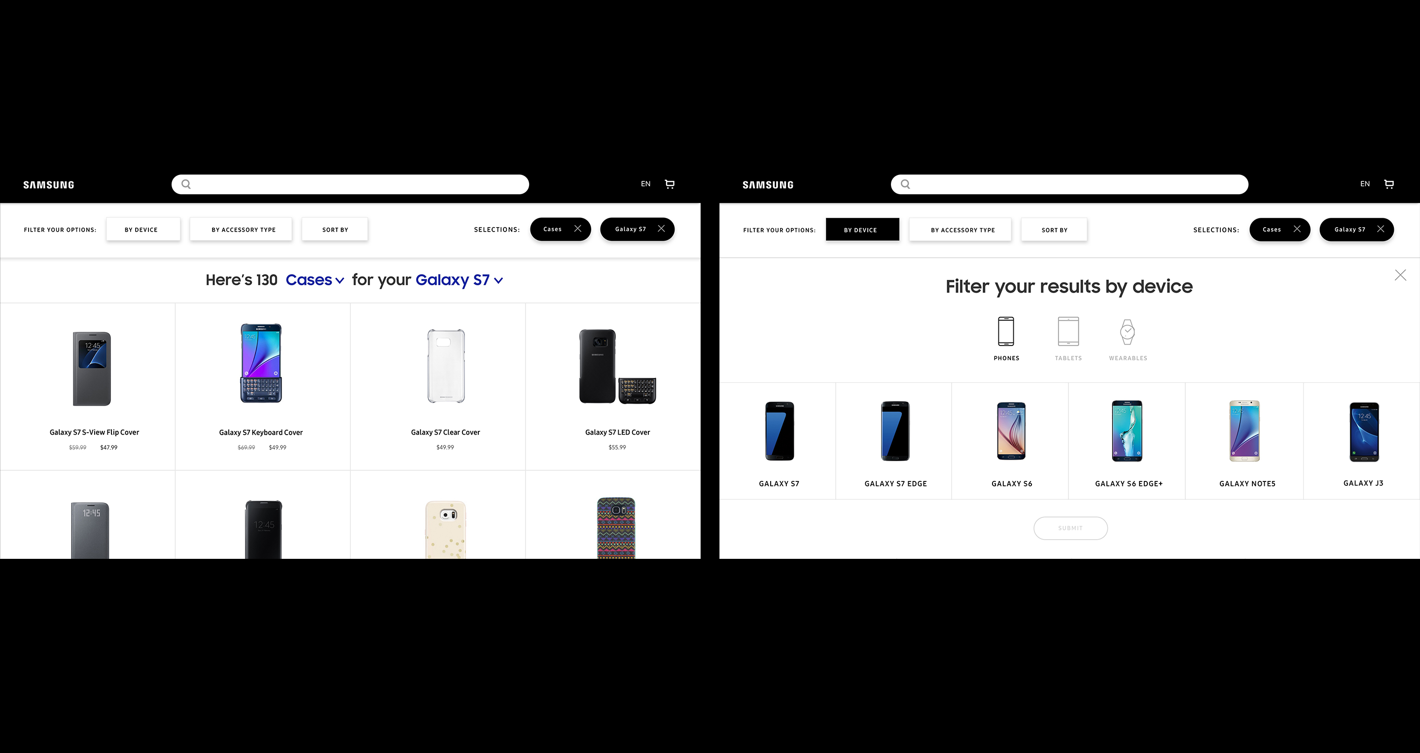
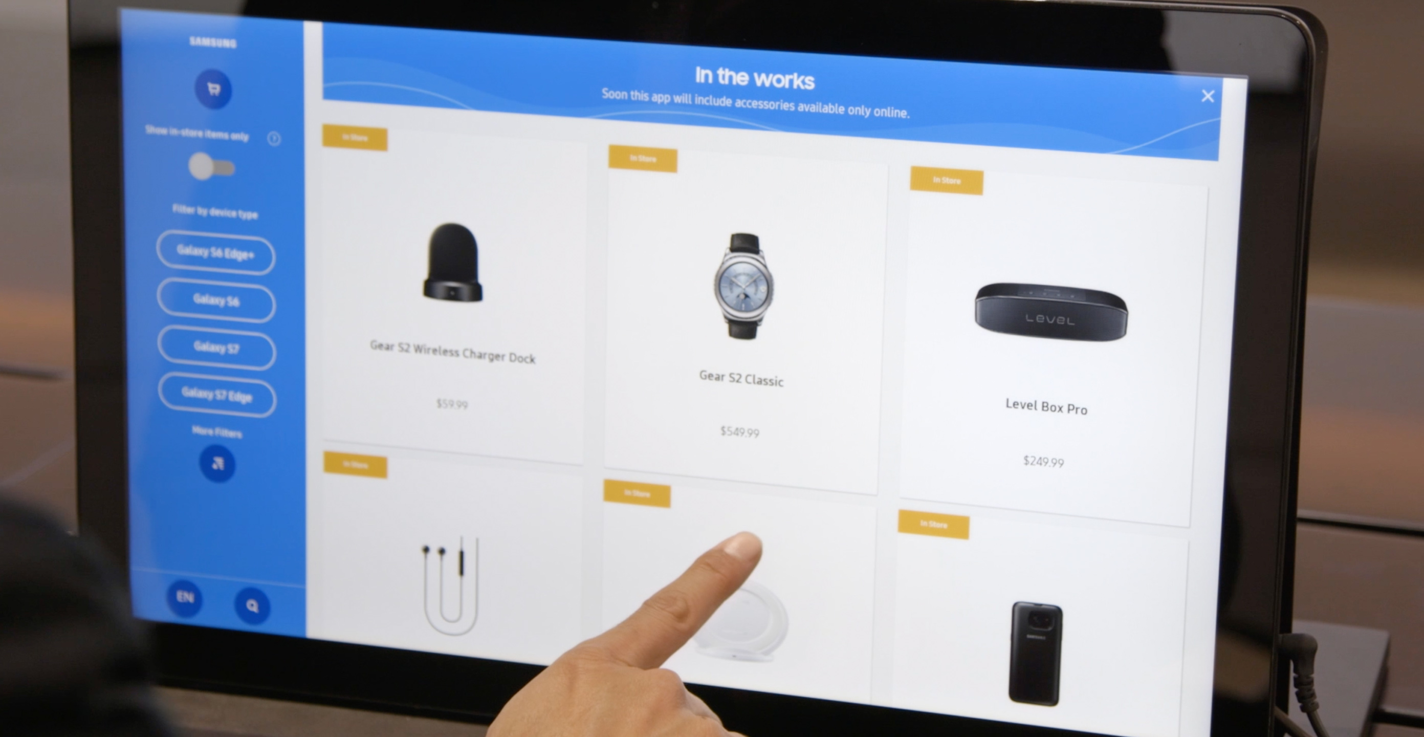
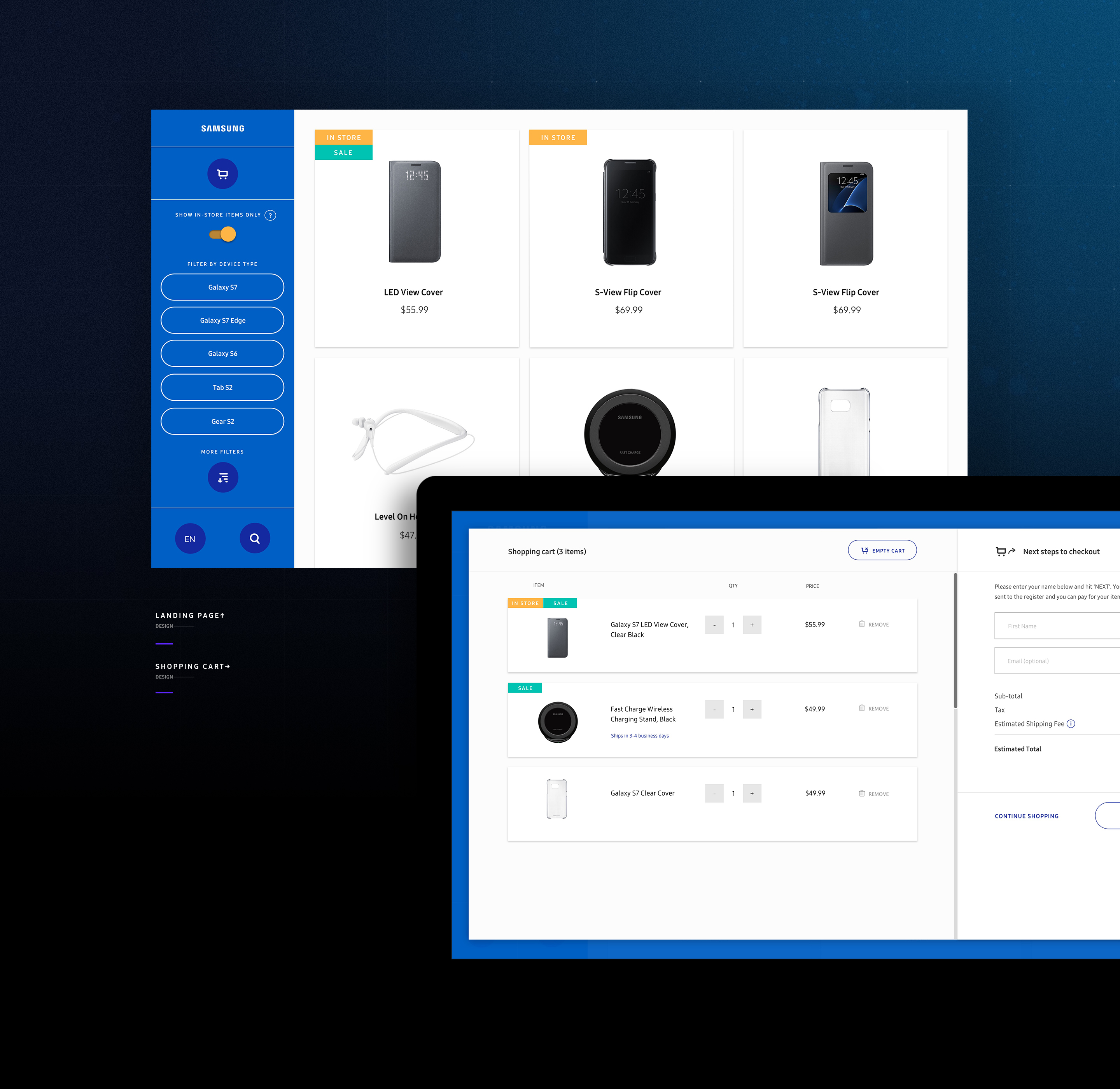
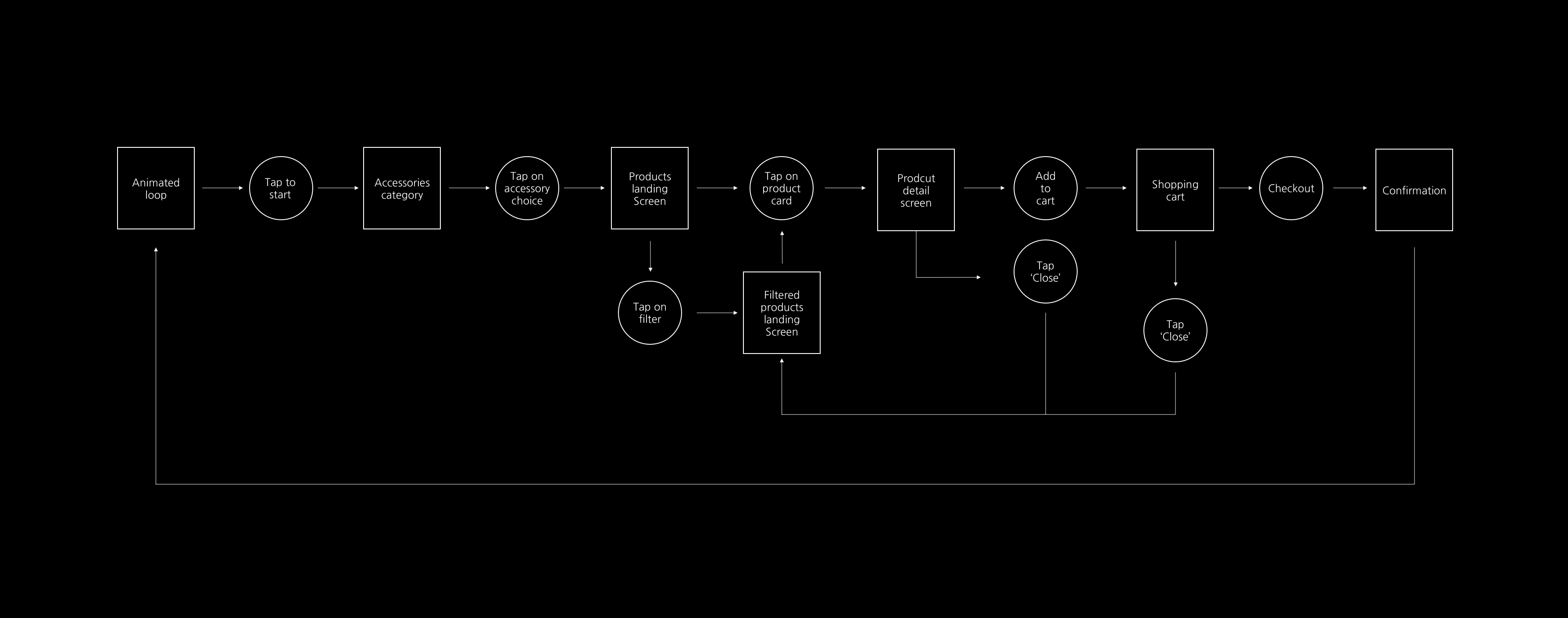
The idea is to find a way to attract customers and design a user experience for customers to shop and help them checkout: well-designed categories and robust filters to help customers navigate products and find checkout easily.
Considerations: How might we convince the customers to interact and shop with the device? What is the experience when users interact with an unusual tablet size?
The idea is to find a way to attract customers and design a user experience for customers to shop and help them checkout. Designed categories and robust filters to help customers navigate products and find checkout easily.
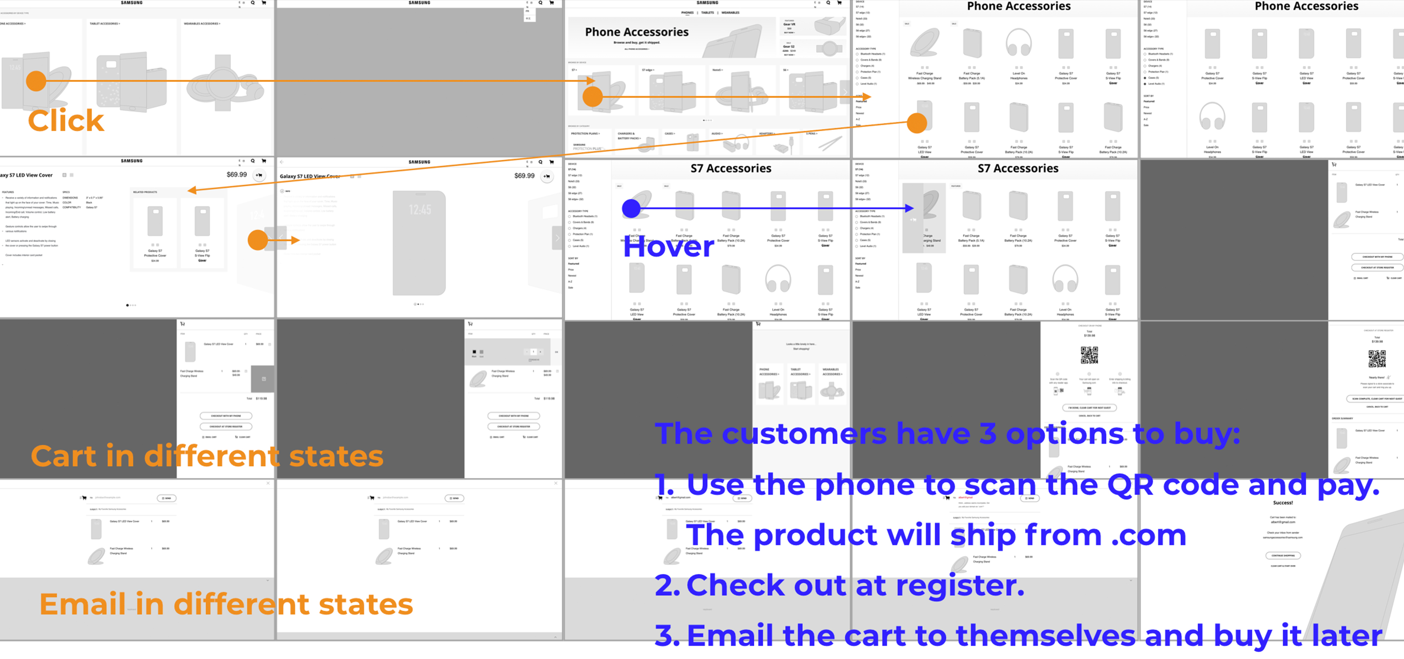
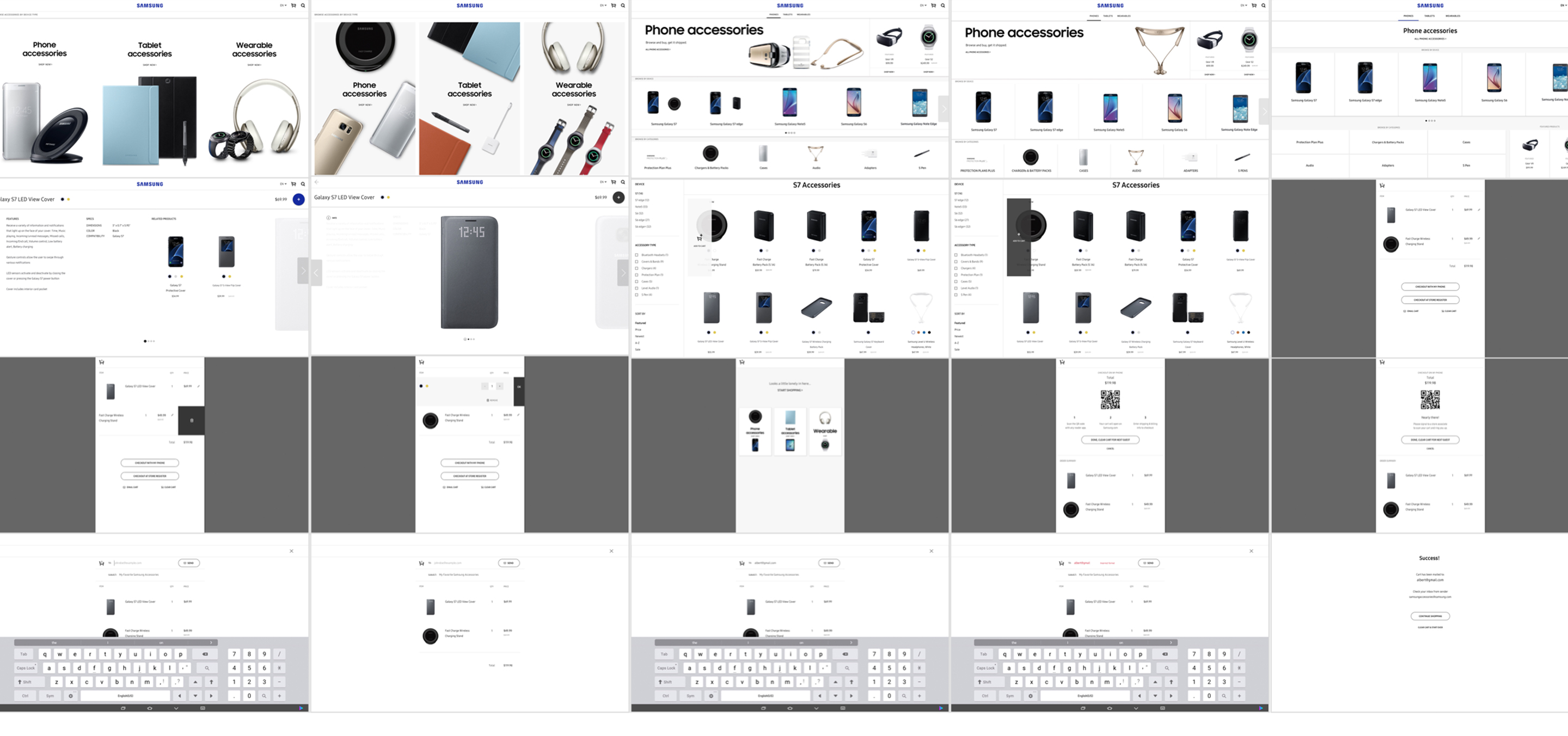
User testing:
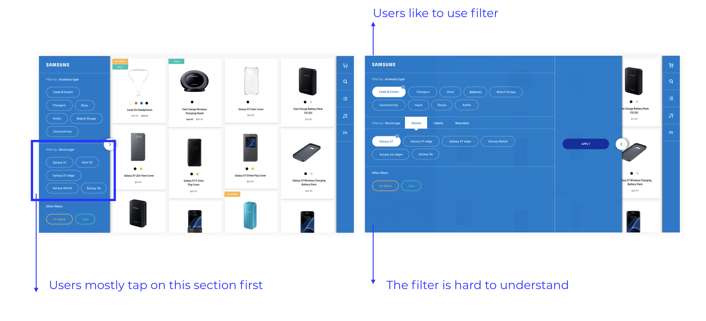
-Users mostly looked for 'Device Filter' because users already knew what devices they owned before they started shopping.
-Users found filters very useful.
-The filter structure is confusing, making it difficult to read through the options.
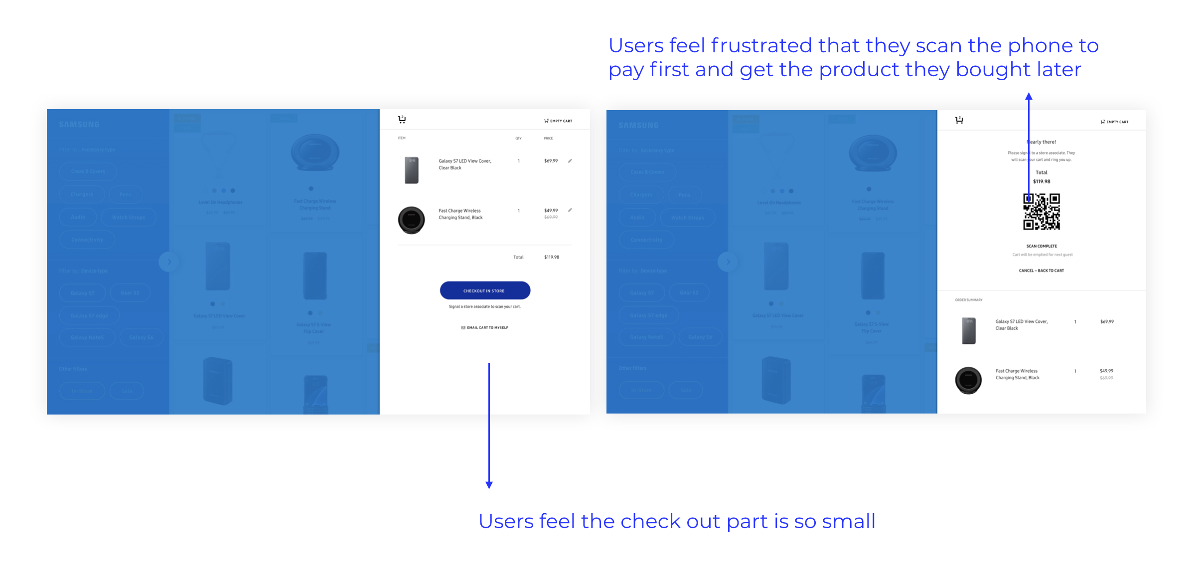
-Users shop inside a store expected to pick up their desired products at the end of checkout.
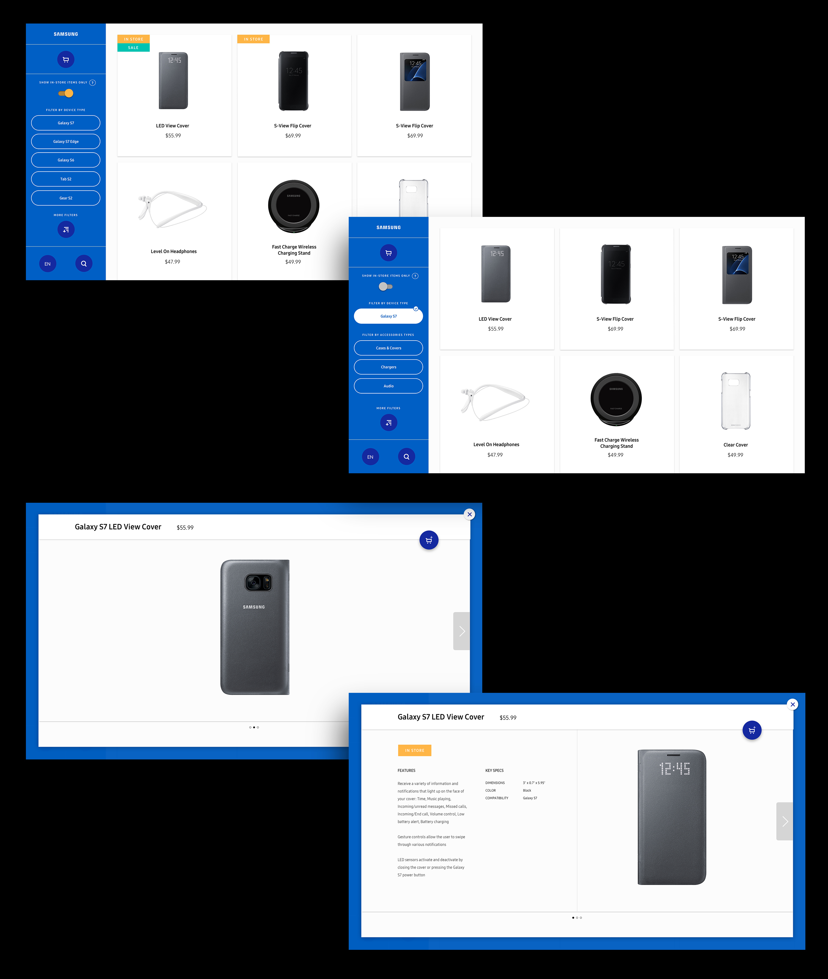
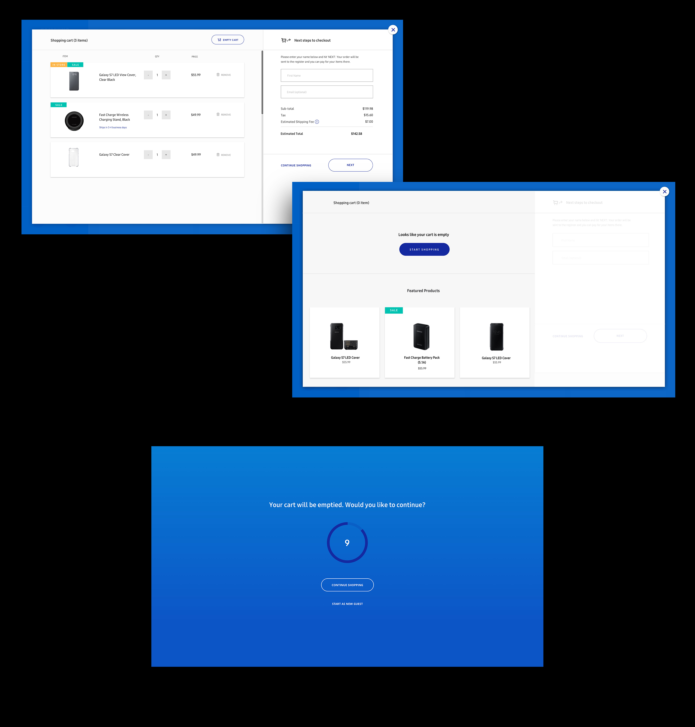
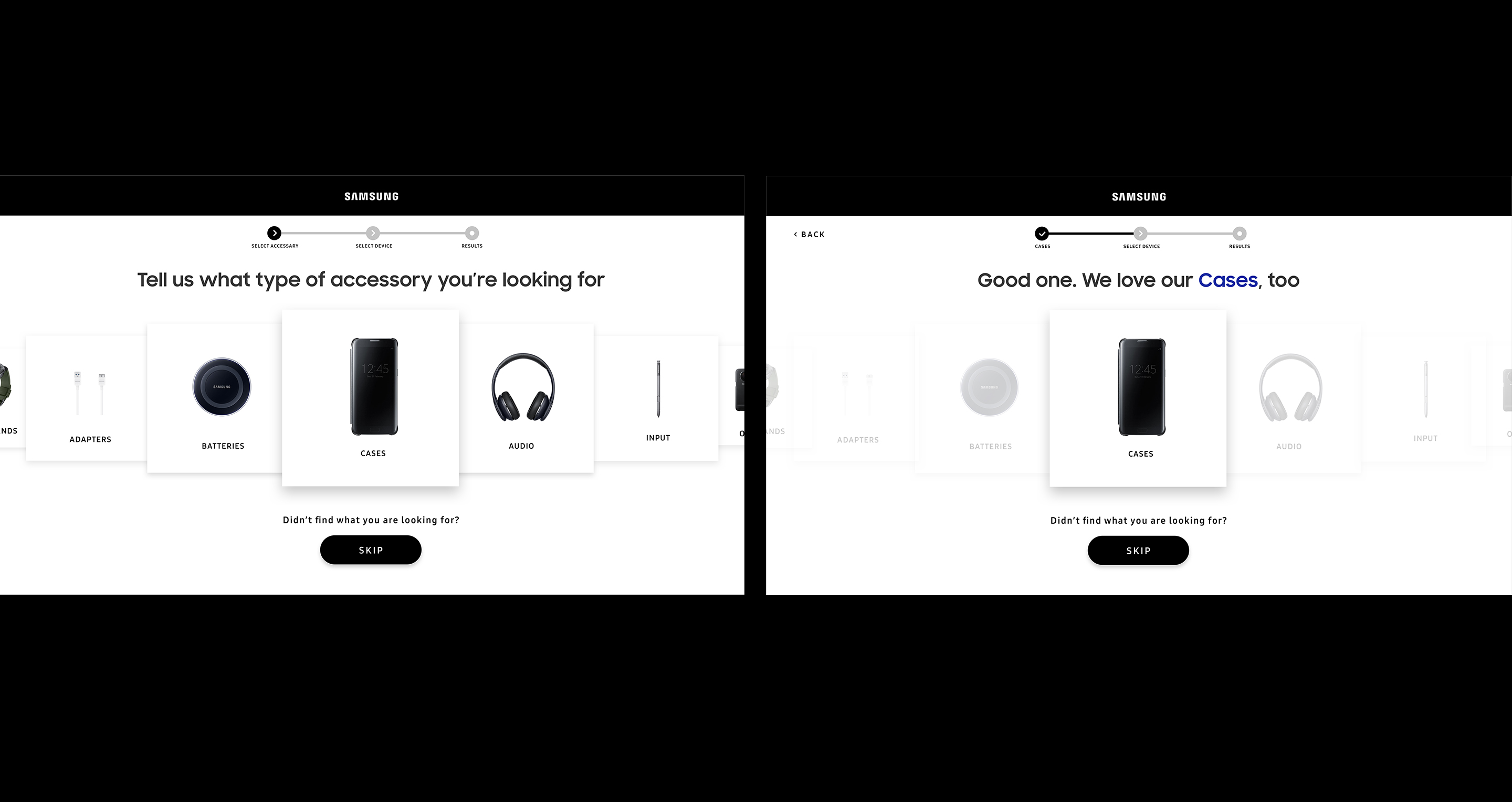
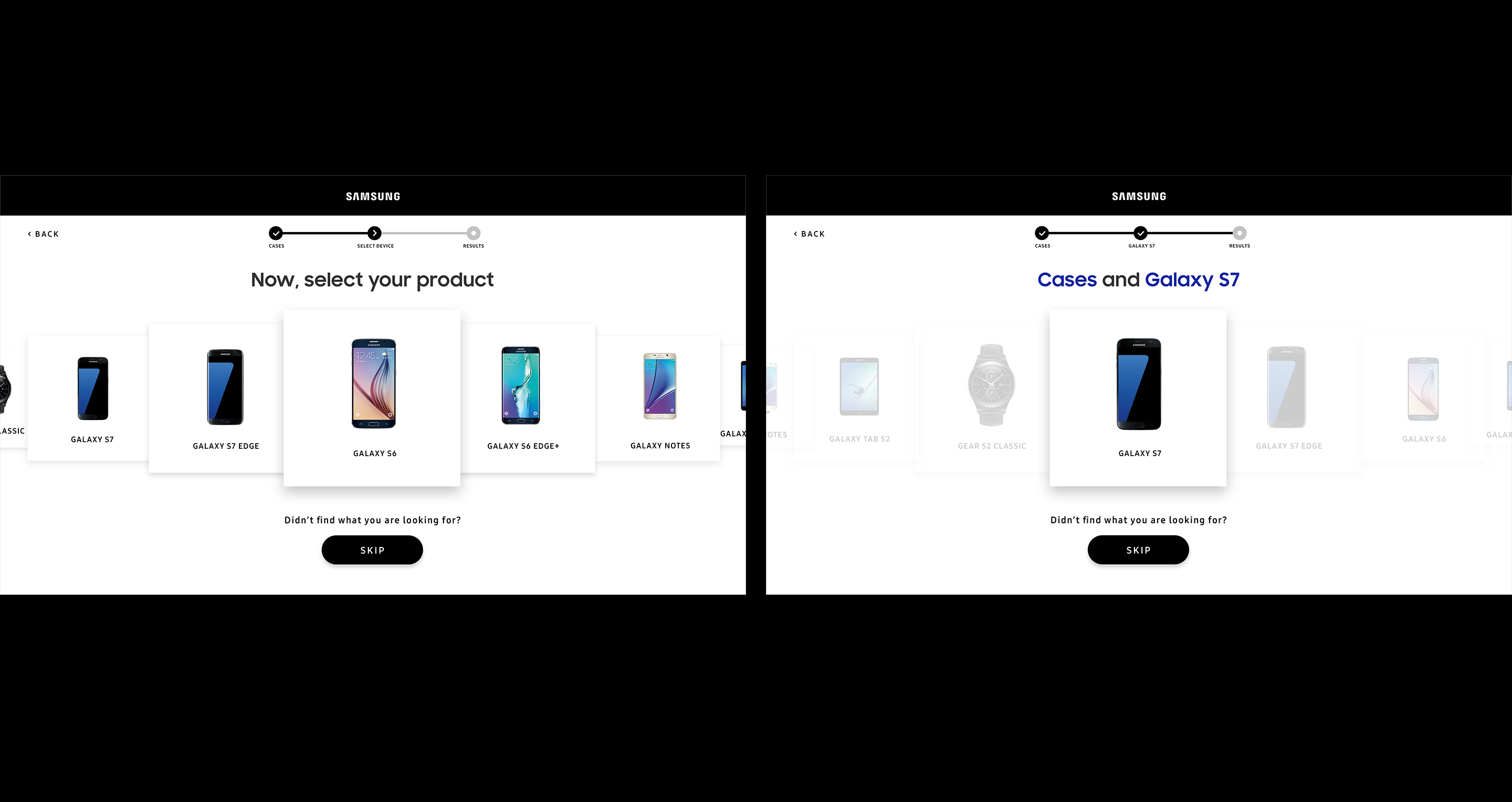
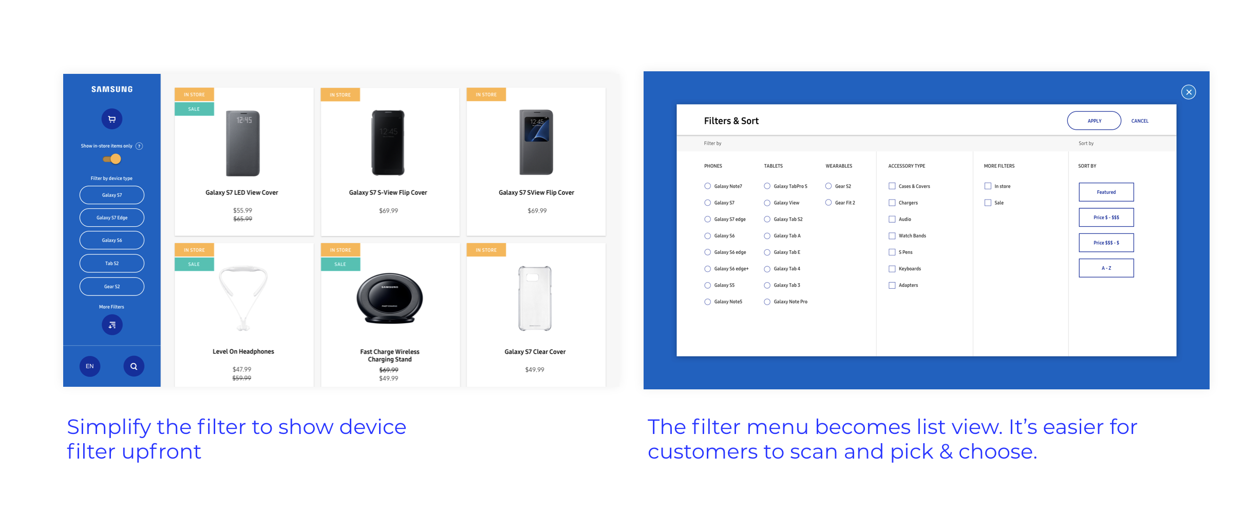
Phase 2: Where we learned from user experience and implied configured buying options, which reflected users' choices at each step, as well as designed the tone of voice more conversationally. We made the first loop limited to main products(categories) and streamlined the opportunities for customers. The design emphasized a more user-centered experience.
Phase 2: Where we learned from user experience and implied configured buying options, which reflected users' choices at each step, as well as designed the tone of voice more conversationally. We made the first loop limited to main products(categories) and streamlined the opportunities for customers. The design emphasized a more user-centered experience.
